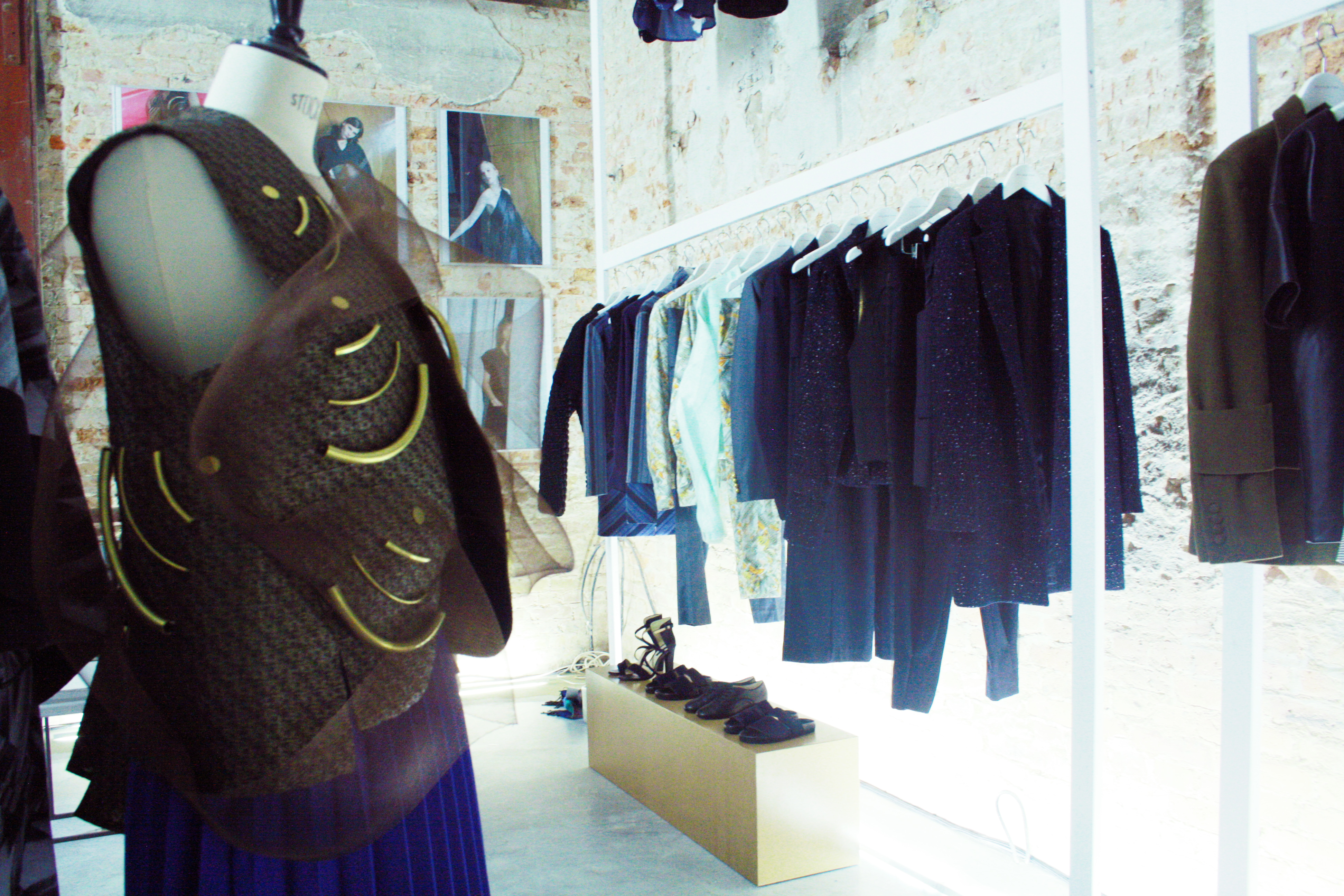
Where else than Berlin would the city’s most renowned fashion university choose an abandoned factory as the location for its Master students’ presentation. After a maze of concrete, narrow corridors and metal staircases one entered the main room where the crowd gathered. The side entrance unexpectedly opened up, revealing a big brick space lit up with bright fluorescent installations.
– Annelie Schubert –
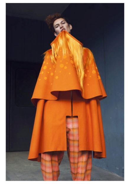
‘Opacity’ by Annelie Schubert was the first collection that caught our eyes. The simple, yet effective presentation of mannequins placed in front of the very slick and stylish lookbook images framed on the wall. The silhouettes referenced fifties Dior-shaped with its cinched-in outerwear and peplum sweaters, brilliantly contrasted with the soft, layered bottoms. Annelie worked cleverly with these seen-before shapes and opted for an interesting mix of fabrics such as fur, neoprene and thick wool, that made for a contemporary collection catered to modern fashionistas.


– Tosca Wyss –
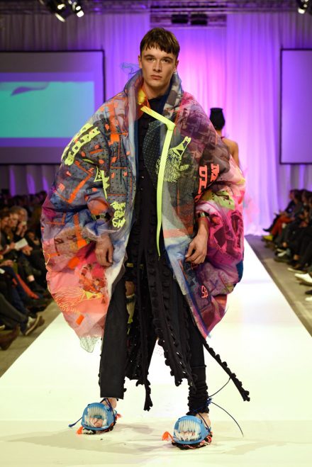
Titled ‘Beautiful Chaos’ the name of Tosca Wyss’ collection says it all. The collection successfully clashed, showing a wide range of pieces in different intriguing materials and prints. Skirts, shorts, shirt, jackets, male and female pieces in Japanese-influenced embroidery, sequins, metallic leather and galaxy prints were combined with a black and white graphic way of layering. The playfulness and boldness of the collection was also extended into its presentation, which included bananas on pedestals and a curtain of balloons behind the dolls.


– Johanna Schneider –
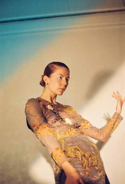
Johanna Schneider’s ‘Blaupause’ was clearly targeting an entirely different group. The collections consisted of knits and mid-length cuts, giving everything an older look and feel. The blue beehive print and sophisticated, powdery hues really drove up the standard of the collection.


– William Fan –
The most professional fashion collection was without a doubt William Fan’s ‘Welcome Home’. An insane amount of silhouettes, male and female, were made available for immediate purchase, indicated the young designer’s foray into the fashion business. The line was comprised of formal wear in evening hues and precise tailoring. The looks were modern, sharp and trendy with some surprising origami-inspired shapes and monumental embellishments. Fan designs for a trendy, confident and slick crowd.


– Serhat Isik –
Serhat Isik took tailoring in another direction. The stand out piece here was a pin stripe suit with blown up army-like pockets on the vest. This designer completely understood the essence of menswear, shapes and fabrics, producing coats, bomber jackets and trousers in the most precious, thick wools. The unique detailing on what would otherwise be an ordinary button-up, demonstrated the designers knack for sprucing up commonplace looks. Props for the beautiful campaign images that exquisitely combined the rough and masculine clothing pieces with a classy, sophisticated atmosphere.


– Christine Noel –
Christine Noel decided to recreate a proper laboratory for her installation, which embodied the designer’s focus on experimentation and deconstruction. The installation, which included test tubes and magnifying glasses complemented Noel’s artful manipulation of textiles. Putting the concept aside for a second, I missed actual garments. Obviously the well-altered pieces of clothing formed dresses and underwear, yet had no shape nor didn’t seem to have any design element, which is a missed opportunity for a graduation collection.


– Luise Zücker –
The final installation of the exhibition, ‘Between Grey’, ruminated the concept of aging. Luise Zücker went with an elderly, grey-haired model and her younger copy for the look book and presented her clothing accompanied by many trinkets you find in your grandma’s attic. The stand out pieces included a billowing jacket made of cat head and a complementary latex cat skirt. The collection included a remarkable range of accessories crafted from plaster and some not so remarkable ones like the warrior princess golden bra.


